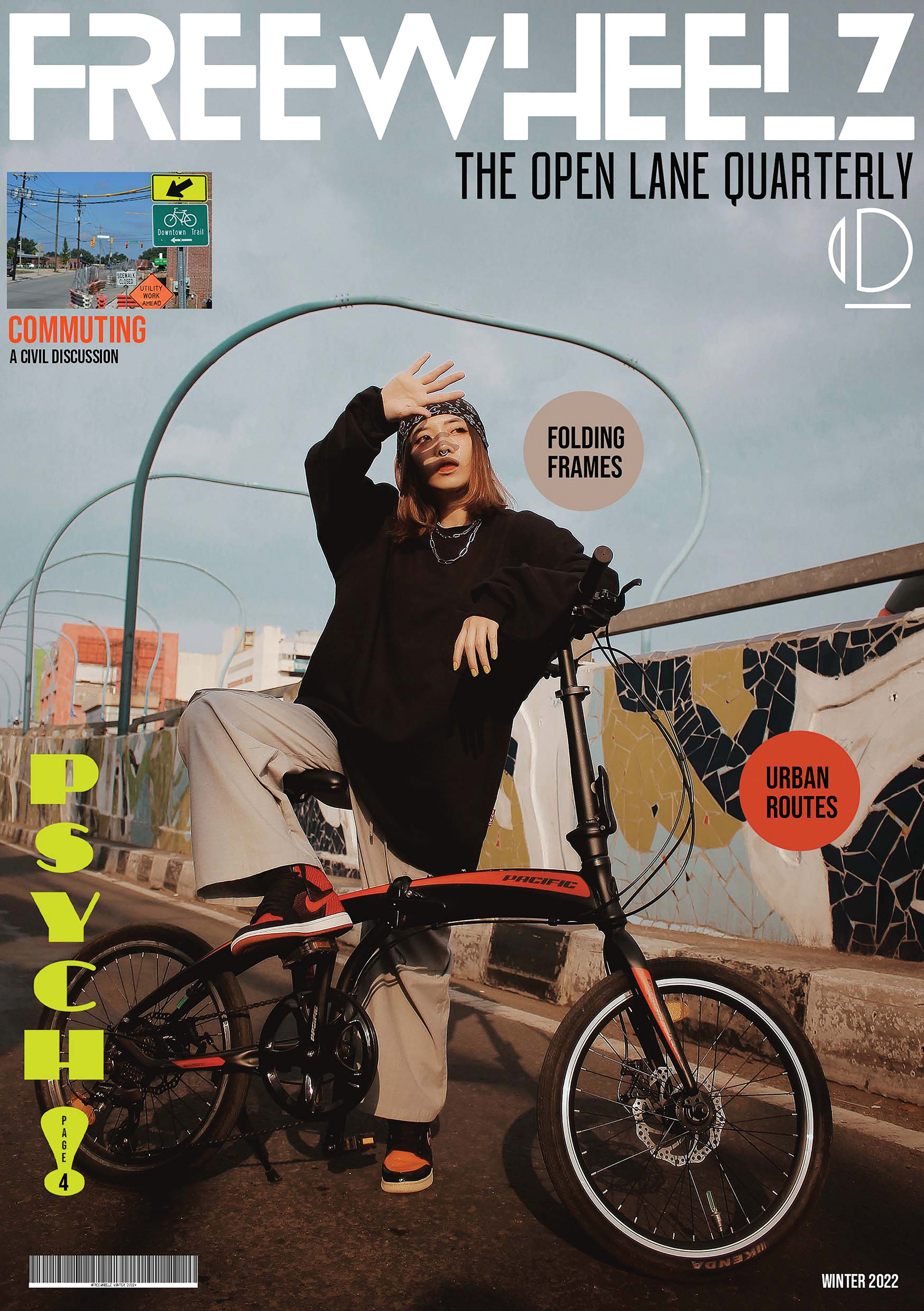
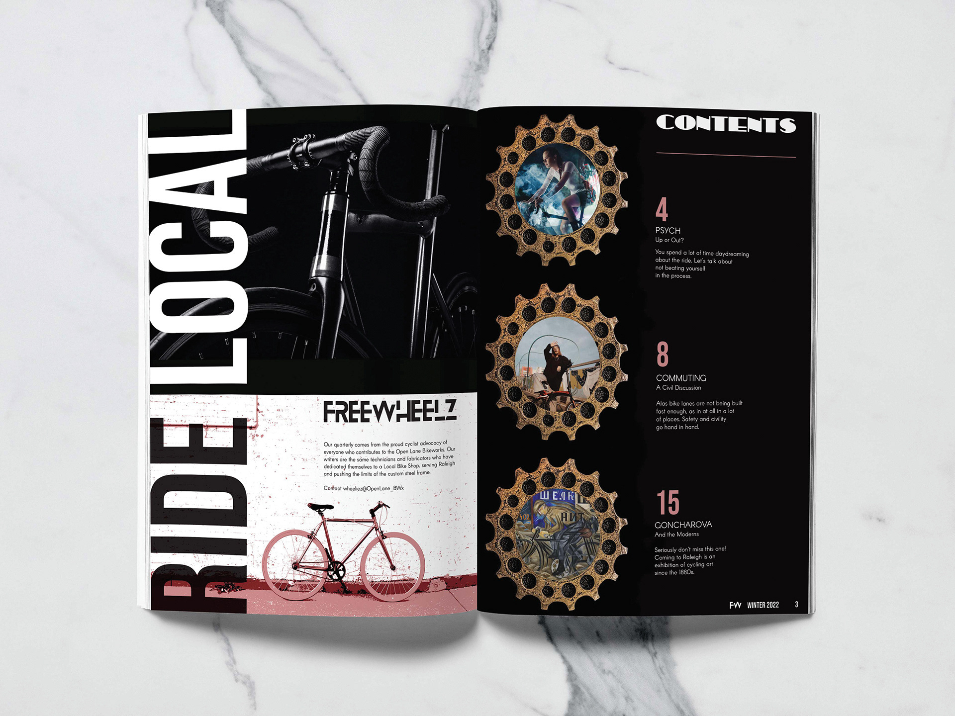
For my magazine spread I chose to springboard off an LBS [Local Bike Shop] concept into a group of techies who just so happen to publish their own community circular, all sporty flash style. Values for design elements like topic bubbles use samples from the bicycle and clothing, a continuity symbolizing the rider's connection with the environment. The gaps in Blanka font strokes mesh with the motif of an open lane. I started with stock images and did some photomanips, writing from the theme of a quotidian cycling state of mind, dealing with the everyday.
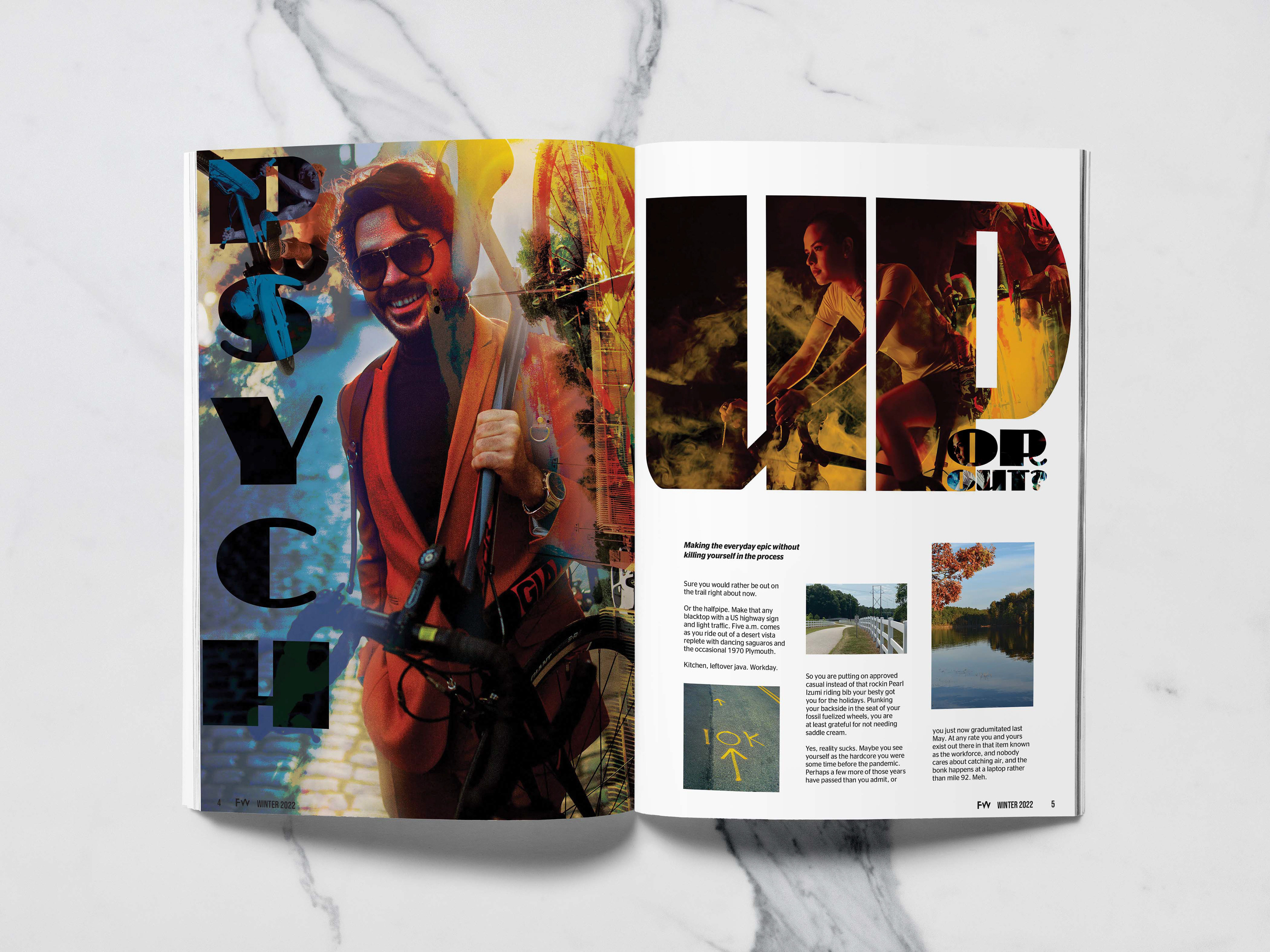
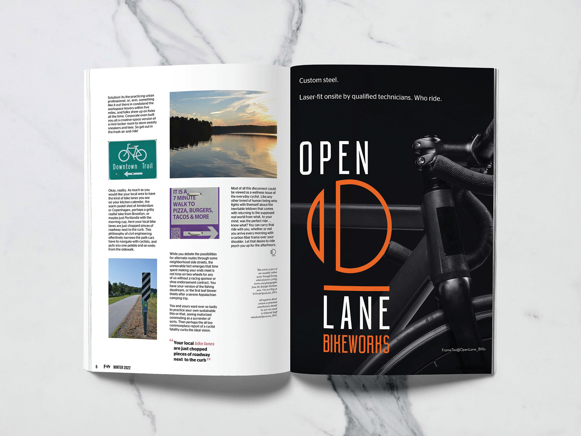
As on the cover these article page numbers utilize a hex value from the tritone image on the facing page. Color sampling departs from high contrast and discordance in favor of an organic vibe. The grungy frames for the headline pictures come from a Camera RAW and masking exercise with a much used Dura-Ace freewheel over a piece of leather (like asphalt). This article takes its approach as a hybrid of advice column and screwball humor set, written for a varied audience of cyclists to read during a working lunch. Story images were taken in the Raleigh-Durham area at places like Falls Lake and the Capital Greenway. Following from the inside cover this advertisement reminds the reader of the technicians and framebuilders who write the stories.
