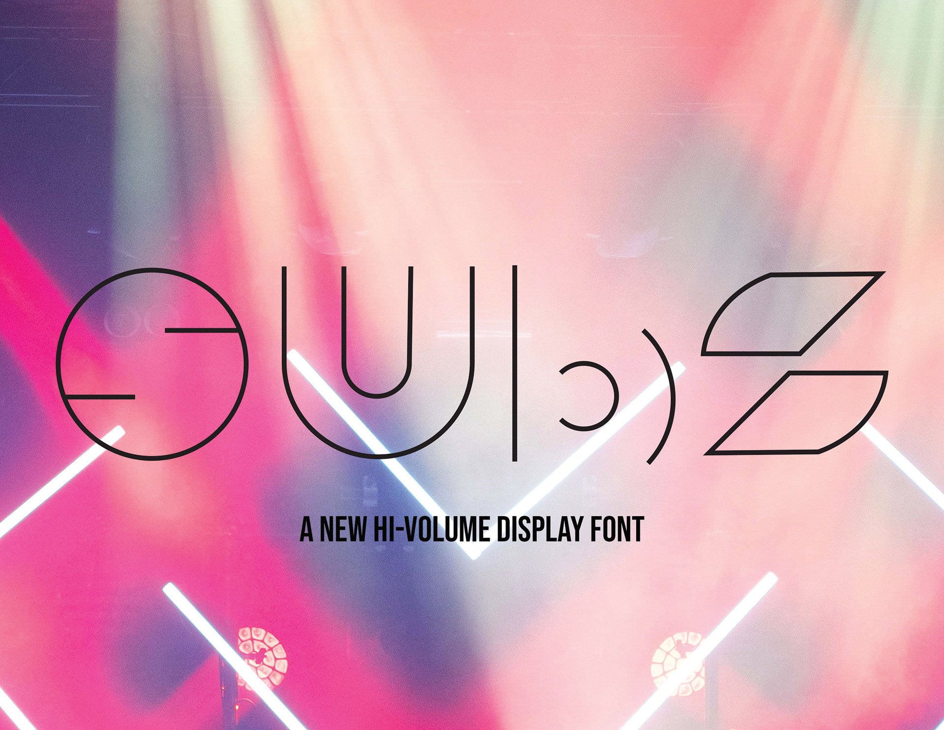
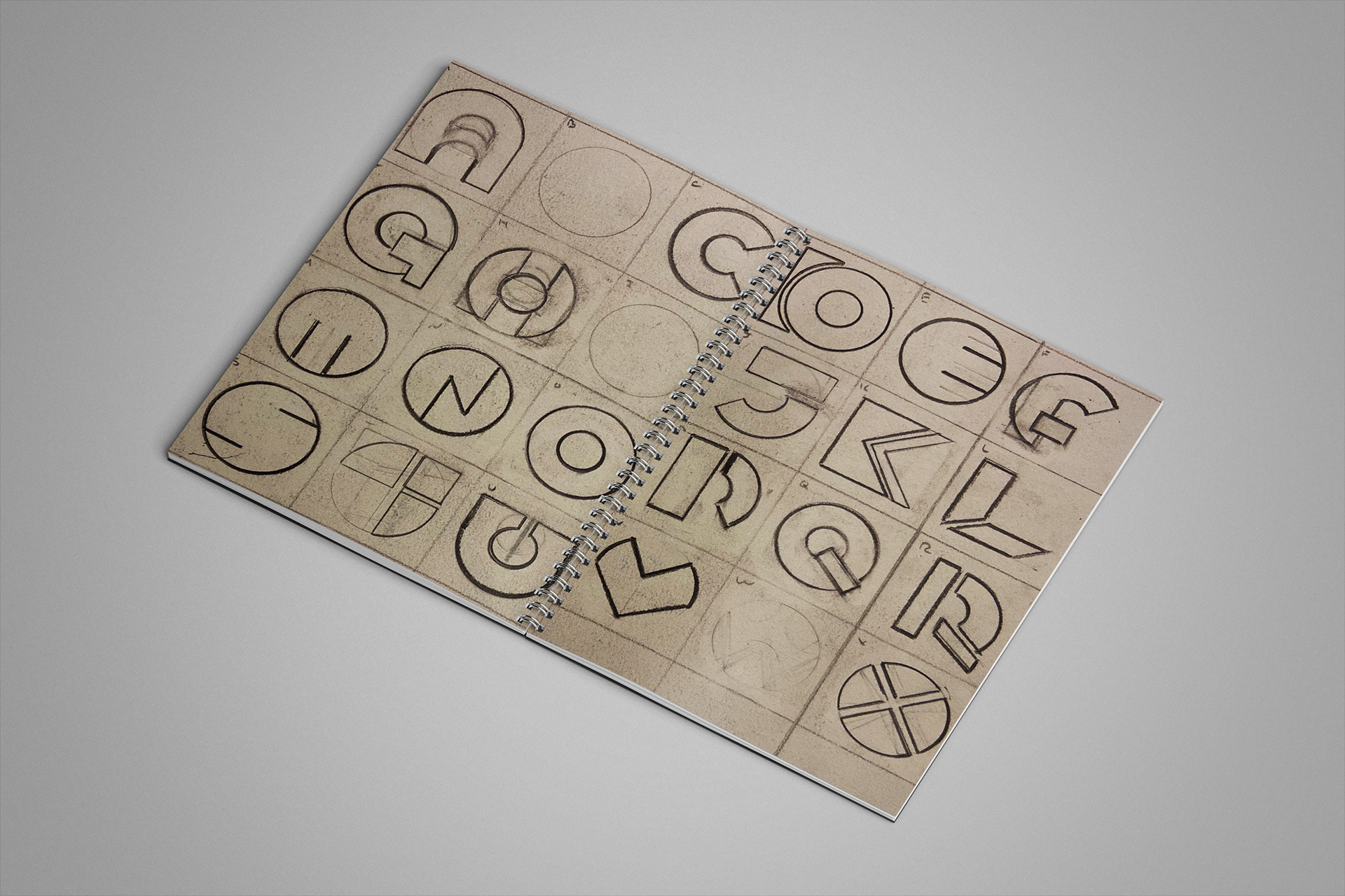
The font takes its cues from jazz funk posters and album covers.
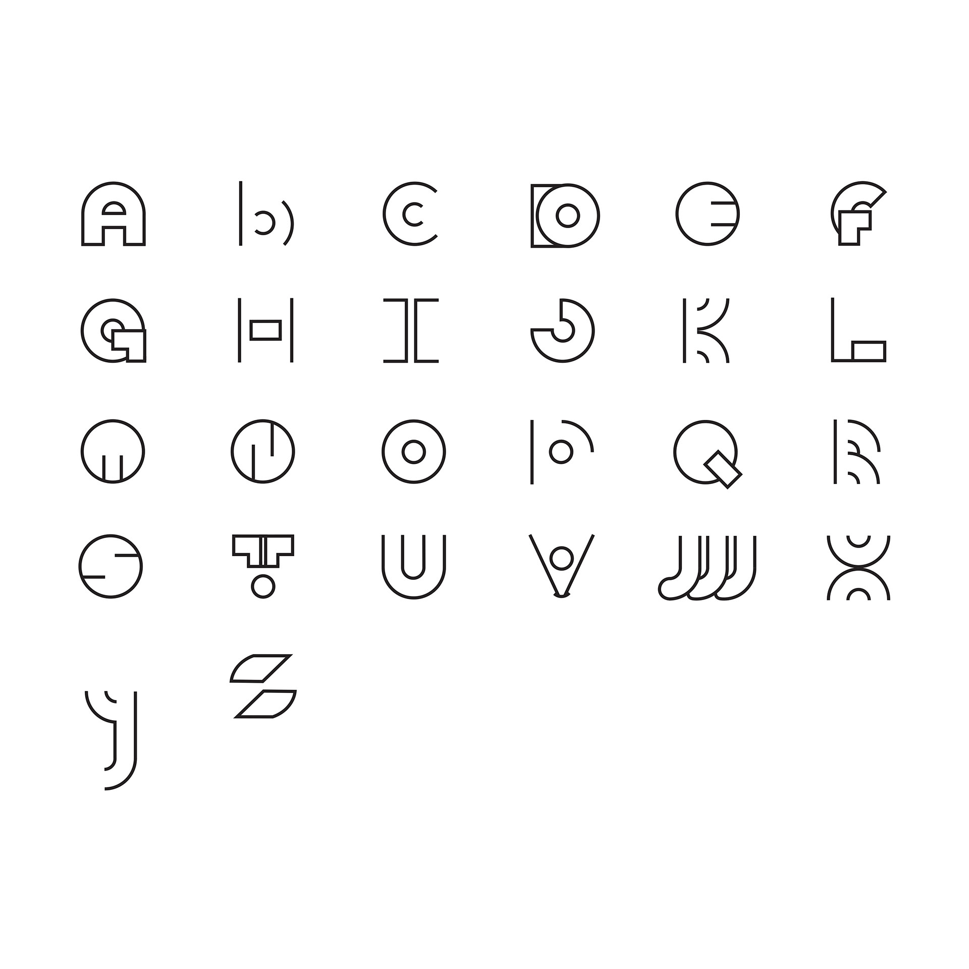
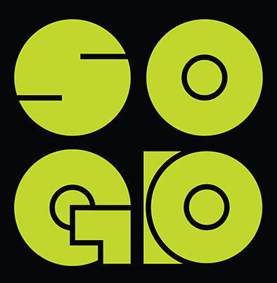
I started with the four letters for my logo which stand for Scott Oldson Graphic Designer.
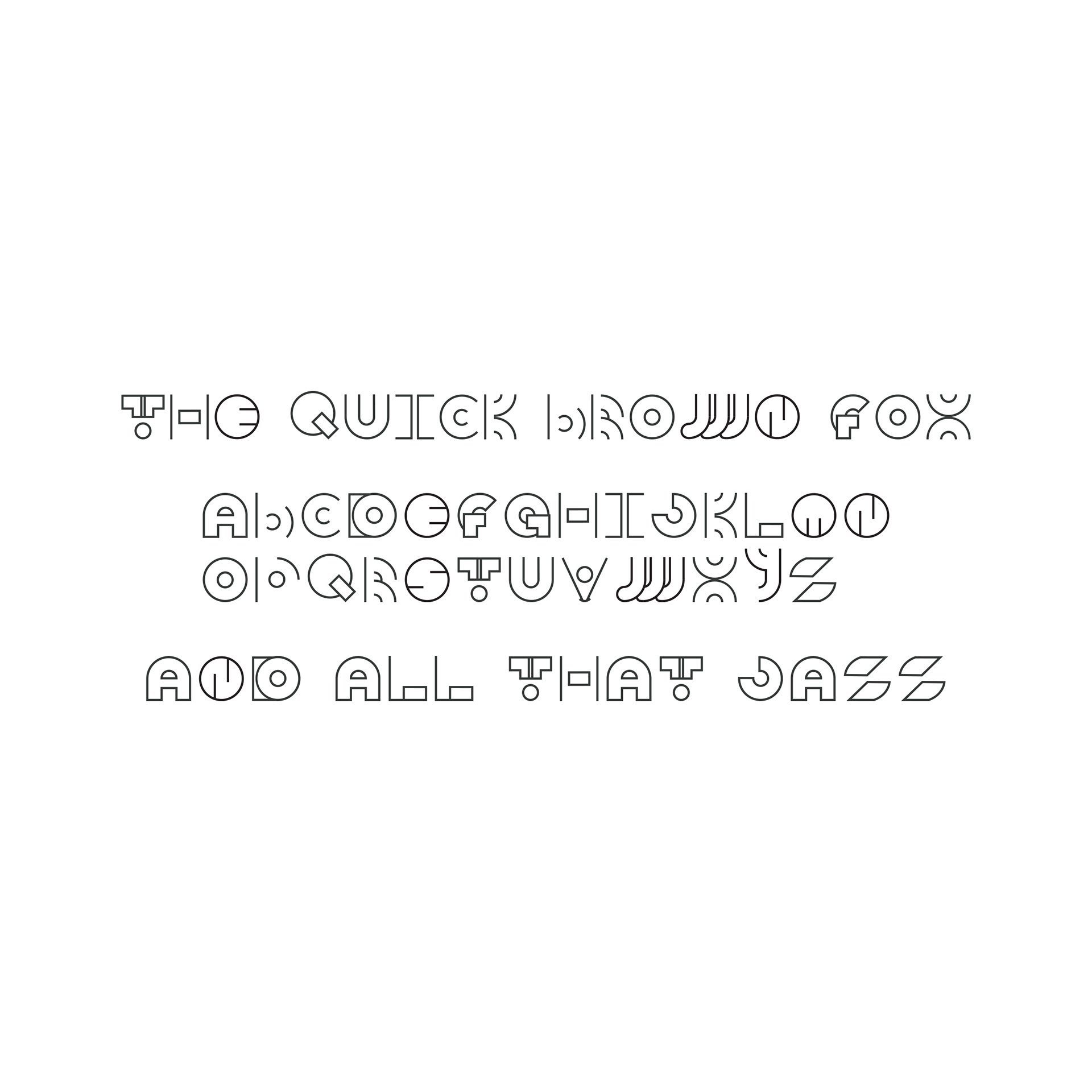
SUBZ proceeds from the dimensions of the base "O" circle and keeps that character proportion for much of the alphabet uppercased A-Z. After passing by an "H" that looked suspiciously like a TIE fighter, I just accepted that some letters did not lend themselves well to curvilinear strokes or stems, following the "O" curves, so after the "Q" I had a base rectangle for the "L" and "F." An upstart "y" made its way in since Fontself would not allow a descender that long, and likewise a lowercased "b," not so uncommon these days since we've got belk's wordmark and the likes of topeka and all-lowercased fonts.
As it stands, the set works as an uppercase display novelty. For the future there will be numbers [which should be fun] and perhaps some glyphs.
